TLDR
- Transformed an informative website into an e-commerce shop
- Usability tested the existing website
- Executed a cart sort
- Redesigned based on user feedback:
- Information architecture
- Homepage, product overview, product page
- Created a new payment flow
- Presented the redesign to clients
- Created high-fidelity wireframes and prototypes
- Design suggestions were 80% implemented
- What I would do differently / What I learned:
- I would engage my clients more actively after the kickoff. The next meeting was the presentation of the usability test results along with initial improvement ideas. Although I asked for feedback, I could have collaborated more co-creatively with them, which would have given them more enjoyment and ownership of the final result. That was a missed opportunity.
- Mobile first! I can’t remember why I started with desktop screens, but if the majority of users do not use desktop (which was not the case here), then the design should prioritize mobile or whatever device the majority of users are using.
- I had too few users for the card sort, but since there were so few items in the shop, I used the results. With more items, I would have needed to recruit more participants.
- Designing is an iterative process—you have to adapt your designs to changing expectations and also adjust when things don’t work as expected.
Brief
I was asked to improve the usability of the existing website and add a shop from Moreau&Tissier who sell Champagne from small family-owned vineyards to restaurants. The website was created in early 2020 and was planned just as an informative site with little importance. Because of lockdown during the Corona pandemic, the company needs to switch from a B2B to a B2C business. There is now the need to transform the website into an e-commerce shop and it will be the new main income generator. The website has a much higher priority now and has to be improved to meet customers’ needs while keeping its style and the existing WordPress theme.
Challenge: To find out what users would expect the website to work like if it was a shop, than it wasn’t at the time of usability testing and how to create a great shopping experience for the users based on these insights.
Facts
- Time: 4.5 months, mid-October 2020 to March 2021
- Client: Moreau&Tissier Affaire de Champagne
- My responsibility: Usability tests, card sort, improvement suggestions, wireframes, prototypes
- Software: Optimal Workshop, Sketch, InVision
- Plattform: use the existing WordPress theme
Objective
- Find out how people interact with the website and if their usage is according to our expectations
- Find out there and what shopping features are expected by the users to create a great shopping experiences
- Define improvements to the existing website (improvements should cost little effort in time and money) and visualize them
- Repeat these tasks when the shop is set up
Design Process
- Think
- Make

Think
Were was no data from google analytics available due to the very small amount of traffic the website created. To find out how to improve the website the following research methods have been applied:
- Usability Test
- Card Sort
Usability Test
General
- 4 users matching the target groups defined by the client
- 3 women, 2 late 30’s and 1 early 60’s
- 1 man late 30’s
- 2 moderated usability tests and 2 moderated remote usability tests
- Duration: 17 to 60min
- Focus: The shopping experience, even if the website does not offer the opportunity to buy products online yet. Prime focus lay on the homepage, navigation, product overview and product detail pages
Questions & Scenarios
Questions
- What is your first impression of the website?
- Which device would you use to go to the website?
3 Scenarios
- Buy a bottle of rose champagne for your friend’s birthday. It is important to you that the product is sustainable.
- You want to find out about events by Moreau&Tissier. Find information
- You bought champagne and it was really good so you want to buy another bottle. You remember the name being something like Etienne. Try to find this champagne
Usability Test Results
To cluster the research results affinity mapping was used
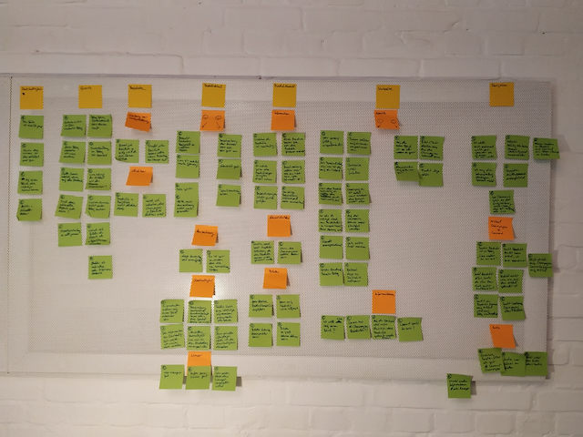
Result Overview:
- All users were able to complete all of the tasks, although one user said she would have ended task one in real life at a certain point because it was too complicated. Others also faced difficulties navigating the website.
- The main critic received the homepage, the navigation to the products, and the product overview
- 50% of the users would use their mobile device to go to the site
Takeaways:
After the first three tests, I heard a lot of negative comments about the aesthetics of the homepage I became unsure if improving the website with its current theme is enough to make it successful. Should I suggest a complete redesign of the website? In the last test, I heard just positive comments about the aesthetics and started to think that maybe improving is the right way to go. I shared these thoughts with the clients to let them make an informed decision. The client decided to stay with their current theme for now.
Result Examples
Example 1:
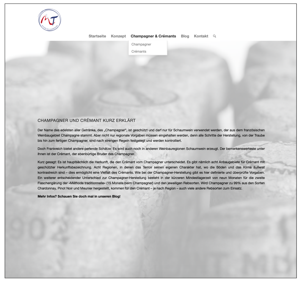
Homepage provides too few informations and appears too simple in it’s current appearance.
Evidence:
16 negative comments:
- “Site seems bland”
- “Site seems like a private blog”
- “A website should raise interest in the product, but this one doesn’t”
- “Not enough information provided” (all users)
Example 2:
The product overview contains too little information to decide which product may be interesting for the user.
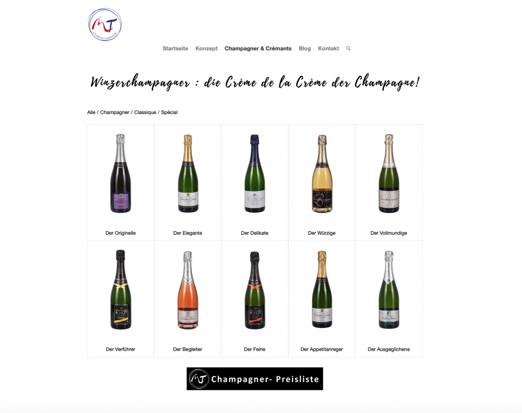
Evidence:
- 3 out of 4 users struggled to decide which bottle to click based on the provided information
- 3 out of 4 users struggled to find the product based on the product name
Example 3:
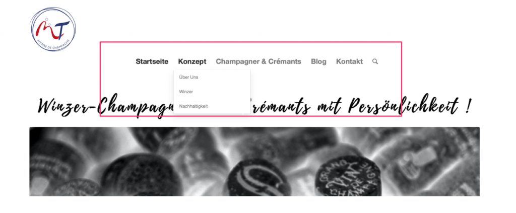
Navigating to the products is difficult due to subcategories and an article placed under Champagne & Cremant
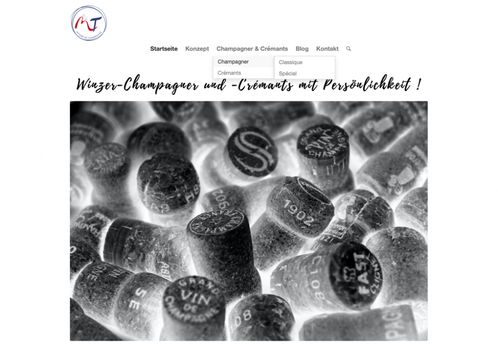
- No categories
- All users are troubled by the submenu, they click it wrong, and or it makes finding the product they are looking for harder for them
- 3 out of 4 users came to this page and did not understand why they get an article when they expect products
- One user followed the instruction and went to the blog. Instead of products, she found old events. This user was highly annoyed
Example 4
All users stop scrolling down the page at the long separation line. Even while they are actively looking for information about sustainability they have trouble finding it, because it is on the bottom of the page.
Cart Sort
To improve navigation a card sort was also conducted
- Optimal Workshop was used
- The first and second layer in the hierarchy examined
- 6 people took part
Results:
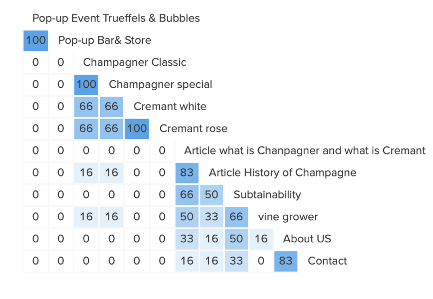
- No user placed the events together with an article like in the current structure
- The two articles should be placed together (83% of users would do this)
- Champagne and cremant should stay together
- For the rest, there were no clear results
Make
Low Fidelity
Based on the research results the site map was edited and low fidelity wireframes made. It was chosen to use low fidelity to go early into the discussion with the client about the suggested improvements. To create the designs inspiration was used from competitor websites as well as other e-commerce stores (like tea-addicts.de and getsuperfluid.com) while trying to stay close to the current design.
Navigation
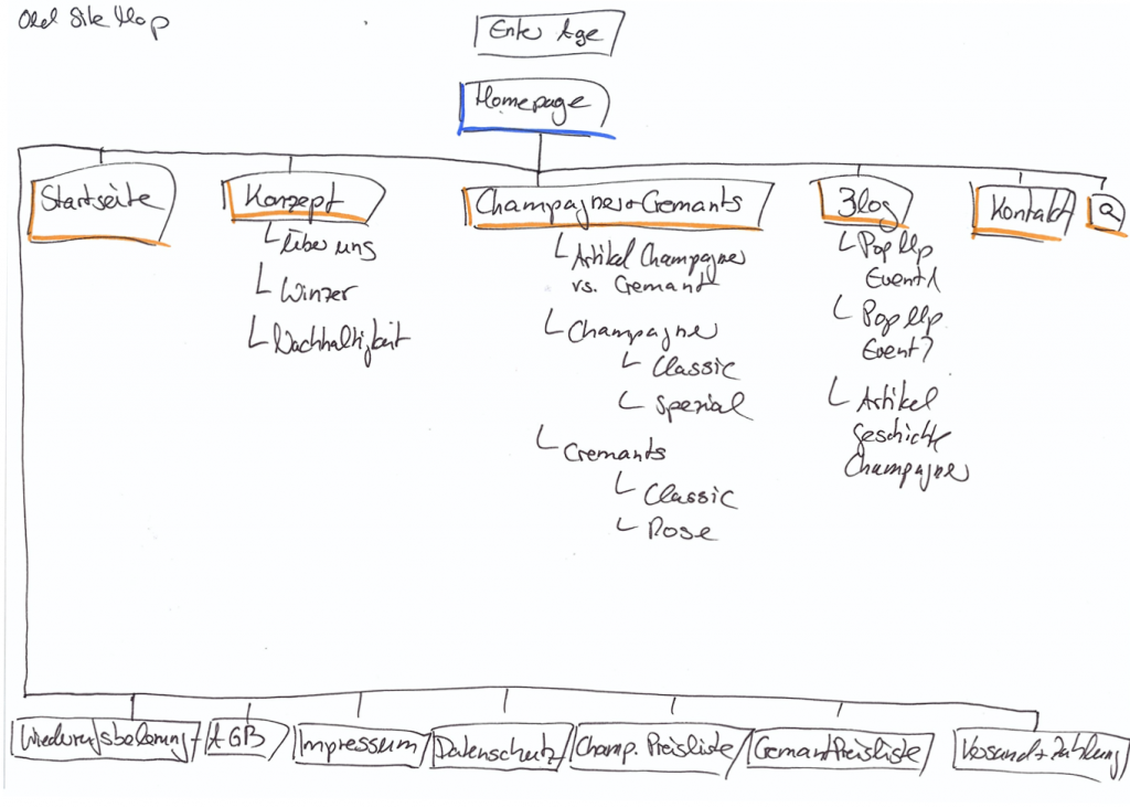
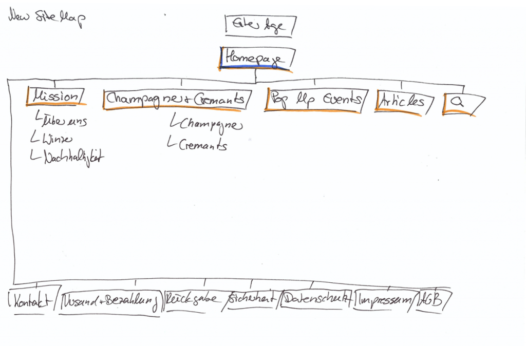
- To go to Homepage/Startseite the logo can be used, this point can be deleted
- Konzept is renamed Mission
- Subcategories inside the Champagne and Cremants section were deleted
- Article Champagner vs. Cremant has moved to articles
- Pop Up Events and articles are separated
- Kontakt has moved to the footer to declutter navigation
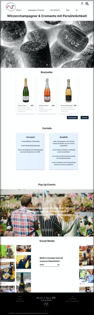
Homepage
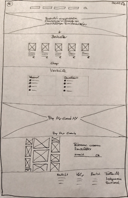
- Enlarge the image to full width to make more impact
- Choose a different hero image
- Add one sentence, tell the users why this champagne is special to raise curiosity
- Add the product to the homepage so that the users get interested in the product and have second access to the shop
- Add relevant content as advantages, next pop up events, and pictures from social media to give the users more information and bring them closer to the brand
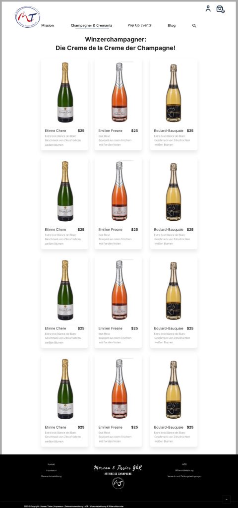
Product Overview
More Information added to the product:
- Name of the product
- Taste
- Price
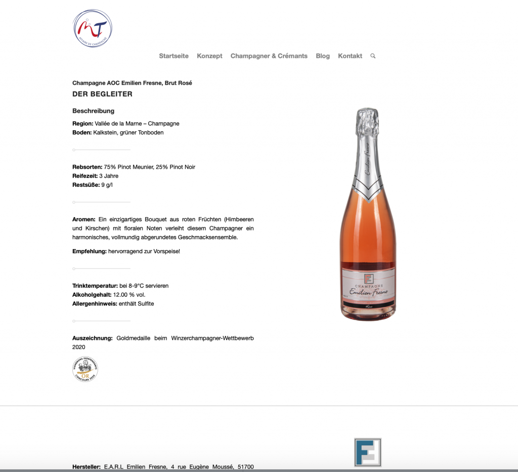
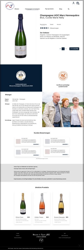
Product Detail
High Fidelity
- Just one type of separator used
- Price and button to buy added
- Selector for the amount of product added
- Sustainability information moved above the fold
After the client presentation and their approval for most of the design decisions, I started making the high fidelity desktop wireframes. Here is the first version:
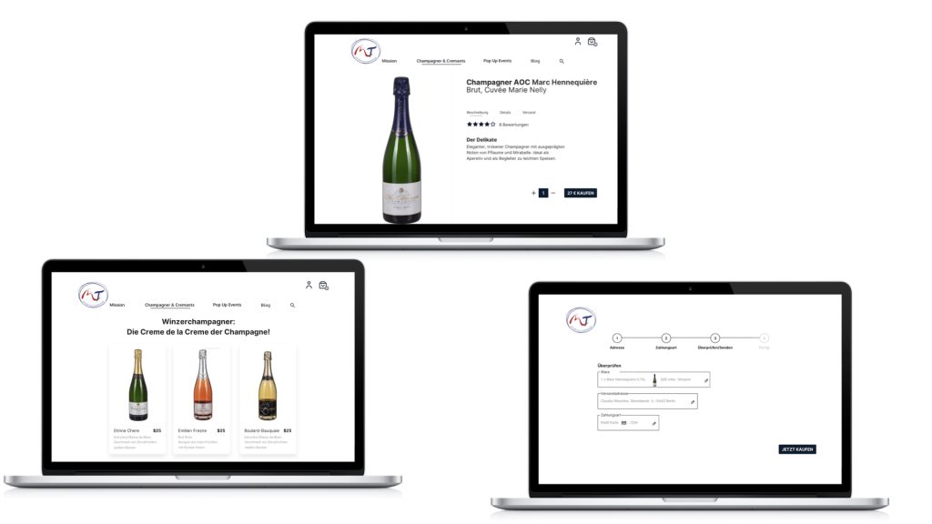
Homescreen
- The homescreen mostly stayed as suggested
- The client loves the hero image and wanted to keep it, so the image has not been changed
- The font of the headline was changed to give the page a more coherent look and make the headline easier to read
- While doing the product section, I became unsure, if the separation of the Cremants and the Champagne is a good thing, because we need two buttons and the user to make an early decision. We will see during usability testing, if that is helpful or distracting
- The event section, is due to the corona virus situation not the most important one. It can be temporarily used for special offers e.g. during Christmas season
- The social media section is now static, but it should be discussed if there is a link to the social media feed so it shows the latest posts
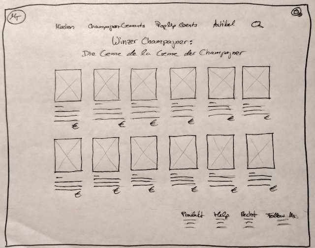
Product Overview
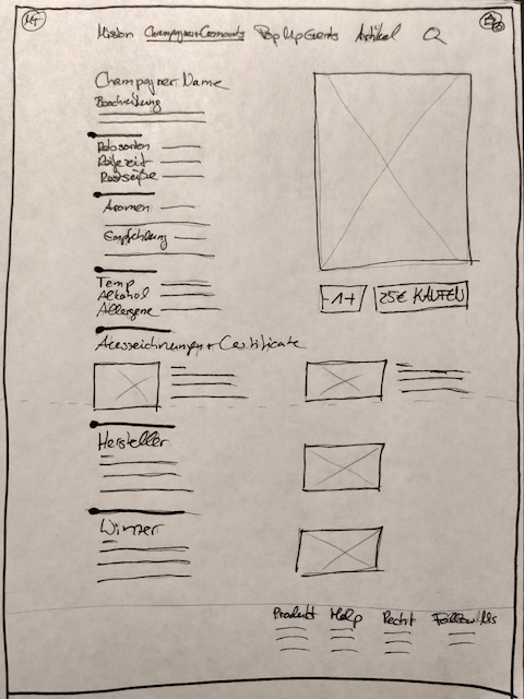
Product Details
- The missing information name of the product, taste and price were added
- The users can now easily decided which product they want to explore more
- The product detail page was iterated a lot. Building the high fidelity wireframe it became obvious that my suggested solution did not work. The page became very cluttered at the top
- The sections were rearranged and tabs used to provide relevant detailed information at the top of the page without showing it all at once
- Prizes and certificates are highlighted
- Reviews and more products have been added
Payment
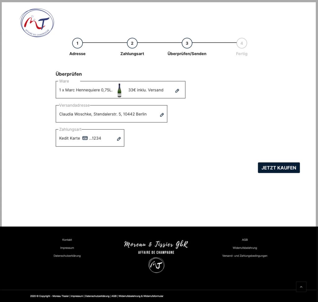
- Payment is a 4 step process
- A progress bar shows the users there they are in the process and can also be used for navigation
- The screens are maximal reduced to make it easier for the user to concentrate on the tasks
- An overview at the end of the process should ensure users in their decisions
- Users have the chance to edit their entries
High Fidelity Mobile Wireframe
- Mobile and desktop version have the same content structure
- To declutter the screen the navigation is placed in the burger menu
- To prevent a very long vertical scroll, products and advantages are accessible with a horizontal scroll
- For better readability text is not placed on images

Next Steps:
- Create missing high fidelity wireframes for mobile to create a prototype that can be tested together with the desktop prototype
- The shop has been built by the web designer based on my suggestions but with a different design. Now we can usability test it
- Compare the findings of the existing shop and the prototype. Is one of them working better and what needs to be fixed? What are the solutions?
- Create an overview and prioritize the findings and their solutions
- Iterate the website for desktop and mobile-based on the most important issues
Future steps:
- Monitor key performance indicators such as goal completion to identify elements that need iteration
- Use Google Analytics to find out more about user behavior on the site
- Try using a heatmap tool to get further information about user behavior on the website
- Iterate the website again based on the findings and also include issues that we weren’t able to fix timewise in the last round
Fotos:
Hero Image: Ⓒ Moreau-Tissier Wine: Ⓒ Pixabay, pexels Glasses: Ⓒ Nadi Lindsay, pexels