Brief
I was asked to create an idea and a prototype for an app where people should be enabled to chat with experts wherever they are. It was part of the creation process to allow me to have free will in what was offered, but it was set that it should be a paid service.
Facts
- Time: The process took 3 months May-August 2020
- My responsibility: UX Design
- Software: Adobe XD, Survey Monkey, optimal workshop, and UsabilityHub
Objective
When I was asked to do a expert video call app I thought about circumstances where a video call solves a problem and the answer is, it bridges distances. So I needed to offer a service that is rare and bring people together who are not in the same district or city.
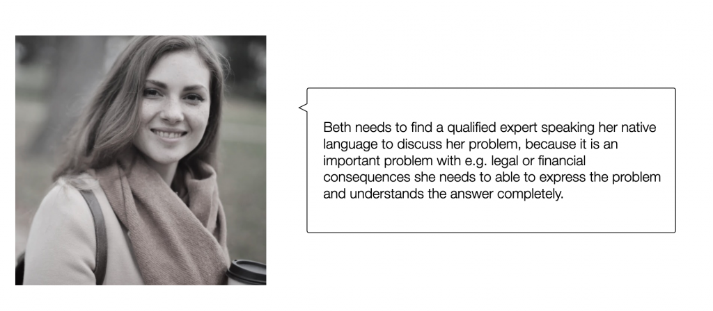
Having lived in a foreign country I have experienced that sometimes it is good to talk to somebody in your native language about serious bureaucratic problems. My Berlin neighborhood is very diverse and you can find everything from a Farsi notary to a Russian dentist, but what if you are not in the major cities or just too busy to travel to the other side of town? This is where the app comes into play.
Problem Statement
Idea
nuhere provides help for people who are new in a county. Being new is not just exciting it also brings a lot of unwanted but unavoidable bureaucracy with it.
Most people haven’t mastered the country’s native language yet which can increase difficulties and make the journey painful. We are here to help with our library filled with reliable articles written by experts on the most important topics and if that’s not enough with our experts to give advice and all of that in the user’s native language. nuhere doesn’t just provide information, it provides valid information by experts the users can trust. Time is too short to spend on bureaucracy!
Later when the app is up and running another group of people should be integrated. Refugees, this group hasn’t left their country willingly. They often don’t have the financial resources to pay for the services. To help them collaborations with NGOs and governmental institutions should be intended to cover arising fees or experts are asked to work a part of their hours pro bono. This will be challenging, but a further step in the development of our app we want to make.
Process
My design process:
- Discovery Phase
2. Exploration Phase
3. Design Built Phase
1. Discovery Phase
The following research methods were applied:
- Competitor research
- Online Surveys
- Interviews
Personas
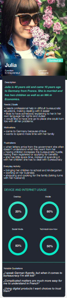
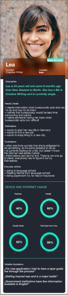
User Personas were created out of the research. 3 Video call interviews and a survey were conducted. The results were structured with affirmative mapping to form two user personas and gain important insights on their needs and goals.
During research, it became clear that people who are newly arrived and people who stay for a longer period of time have different needs. According to these two personas were created. One Persona that is newly arrived and one is staying for a long time in a foreign country. A third and fourth persona should be created, the expert and the admin to fit the application also to their needs and goals.
User Journey Maps
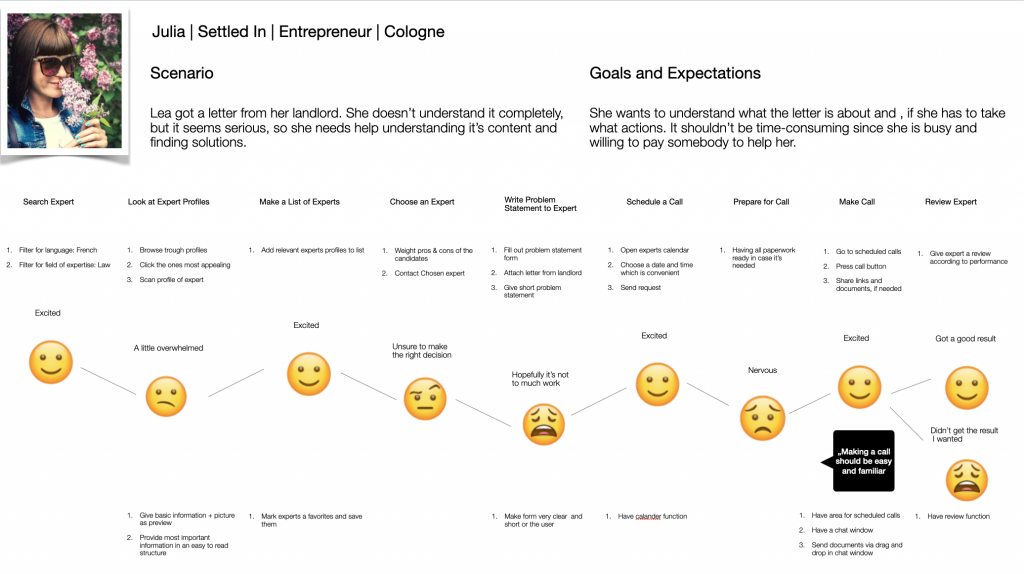
To dig deeper into understanding the user’s needs user journey maps were created. They show the user’s journey in a certain scenario using the app and give insights on pain and pleasure points. Different scenarios for each persona were created to better understand the context the user is in and enhance our empathy as designers to our costumers.
User Flow
„As a person who is busy and troubled by bureaucratic German, I want to talk to a lawyer, so that I can understand the received letter from my landlord.“
Julia
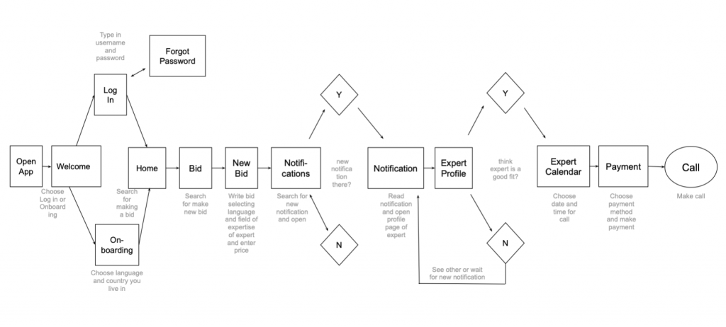
Based on the research user stories were created. Based on the story’s entry points, goals and user flows were defined. Showing the user’s route through the system including the different paths she can take. Most troublesome was the payment section, different possibilities were explored and the most suitable was chosen.
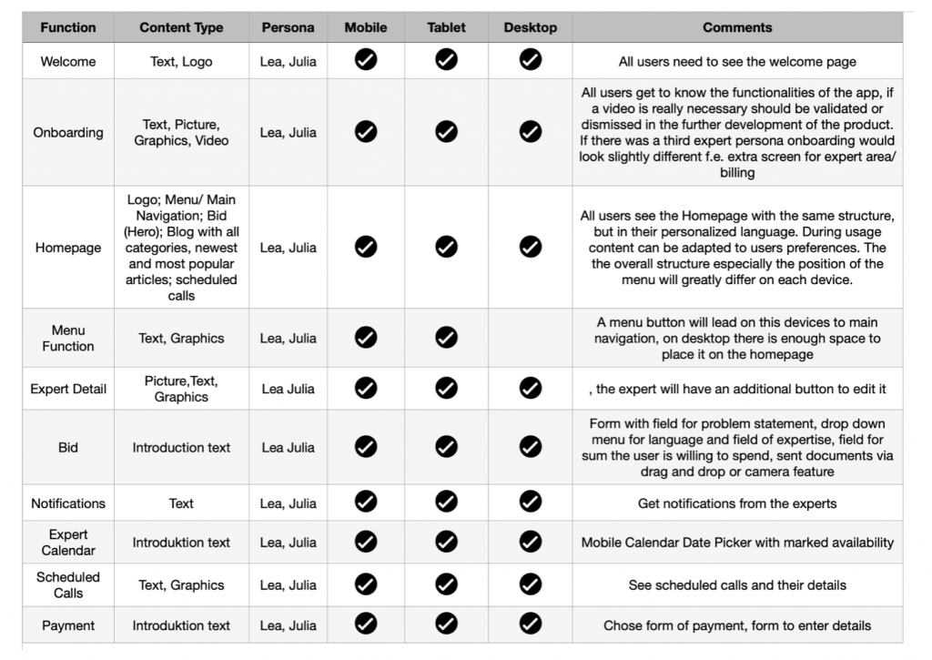
Mobile First
Our users will use both desktop and mobile version, so both have to include all pages and features necessary.
However content layout and overall structure of the app will be different and according to the device it is used on. There will be an extra section for experts for their income that differs from one of the user’s who will have a payment section. All information is provided in the users language of choice.
Site Map
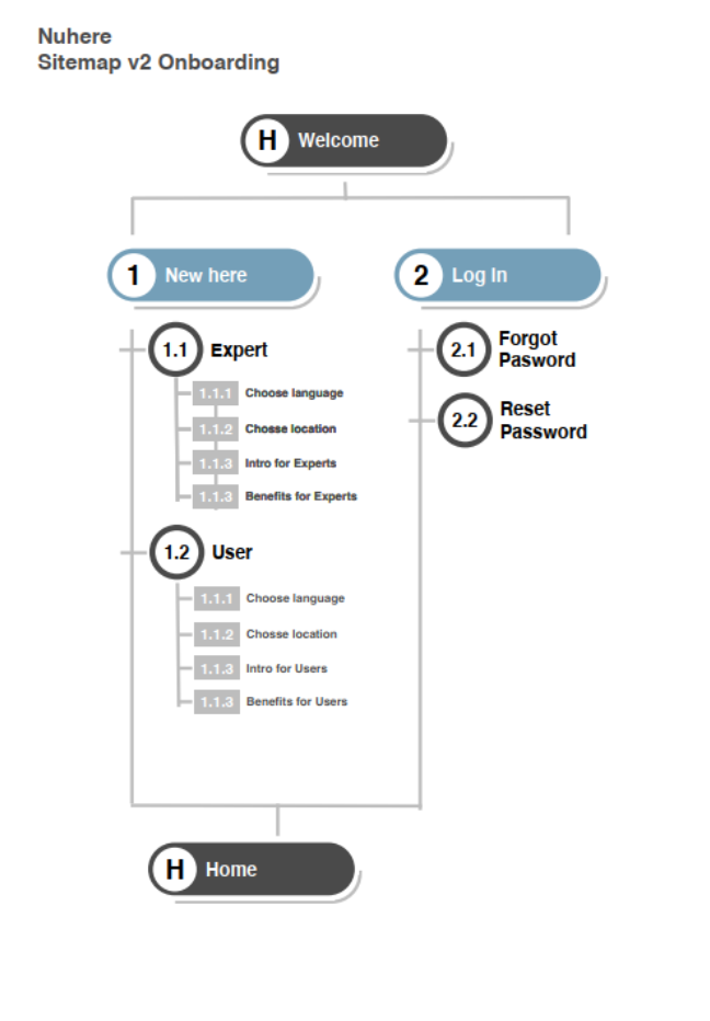
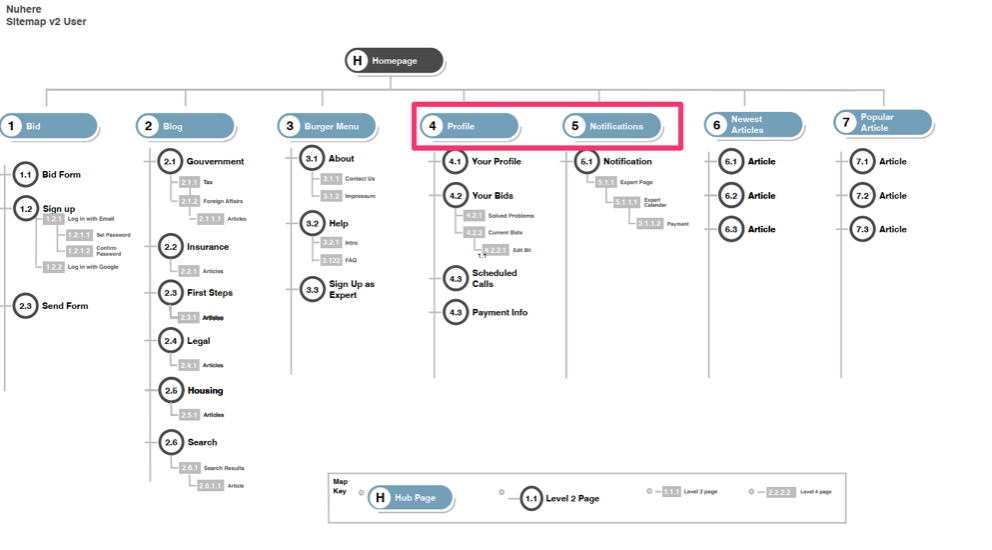
- A site map was created. For refining the site map we decided to use a card sort and to have a look at one layer in the hierarchy. The goal was to find out which items should form groups and how these groups should be named. For the card sort, we used optimal workshop to reach more people and to analyze the results quickly.
- Based on the results of the card sort the site map was iterated. Onboarding got its own sitemap and there is a slightly different onboarding for experts and users. Some sections moved up in the hierarchy as notifications and some were renamed.
- After creating the wireframes parts of the structure were changed e.g. it was decided to have “choose language” and “choose location” change places. Because the available languages depend on each location top ten immigrants or to place notification under profile to declutter button navigation
2. Exploration Phase
Low Fidelity Prototype
Mobile
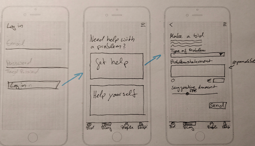
Based on the user flows and the site map a low fidelity prototype was sketched on a paper. Paper and pen were used as a quick method to test ideas in a quick and easy way.
- For me, it was hard to work just with boxes and imagine the user’s interaction with it. So I added copies. Although there is no copy necessary in this early stage, they helped me to get a clearer vision of what the app should communicate. These rough copies were then refined during the process.
Low Fidelity Prototype Desktop
Doing the desktop prototype was much more difficult than the mobile one. While limited space and the portrait layout of the mobile phone set clear limitations of what could possibly work, the vast space of the desktop turned out as a huge space with endless possibilities to fill and to approach it.
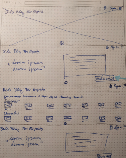
- Biggest Challenge: To figure out the top navigation was tough. A lot of screens have been drawn, with all the navigation elements in one row once placed left, once placed right. Different elements were hidden in the burger menu or sometimes they were all visible, but nothing was right until we split it in two, have the function-based navigation (focus on icons) in the top left and the content (written words) based a little lower in the top right corner of the screen.
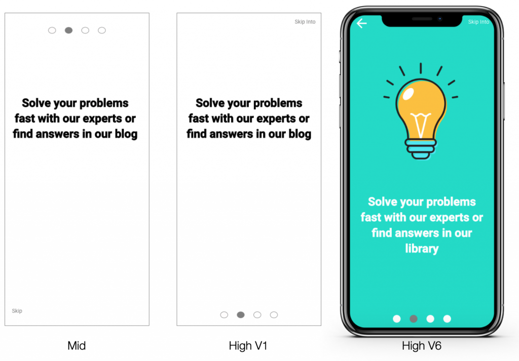
Onboarding Approach
Already in this early stage, special attention was given to the onboarding, because they are the first screens that the user encounters and they set the tone for the whole experience of the app. The key information was defined which should be transported to the user:
- nuhere speaks the user’s language
- nuhere helps solve problems fast
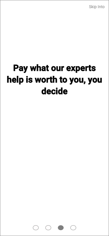
- Users just pay what the information is worth to them
- All experts the user needs are in one place
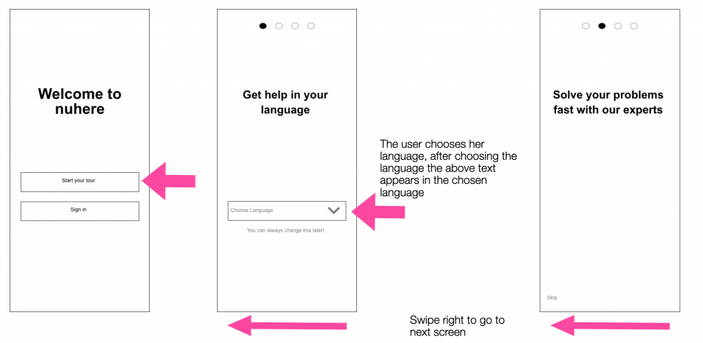
Onboarding Navigation:
We will use known swipe gestures to let the user navigate through onboarding. This is more intuitive and appears more fluent than buttons.
Methods Mobile:
In the conducted user interviews users expressed how important it is to them to understand the benefits of an app to decide to use its paid services. This is why we will focus on a benefit-oriented onboarding. While the user is interacting with the app for the first time we will also use coach marks to explain key functions.
3. Design Built Phase
During the built phase a high fidelity prototype was built and usability tested by 7 users. Preference tests were made. Findings were analyzed and the design iterated.
Usability Testing
Two kinds of usability tests were run.
First we did prototype testing:
- remote moderated usability testing with 4 participants on a desktop device
- moderated usability testing with 2 participants on a desktop device
- 1 moderated usability test on a mobile device
The difference in approach is due to the availability of the participants as well as the necessity to do at least one test on a mobile device the get more substantial feedback on sizes and overall navigation.
Findings Usability Testing
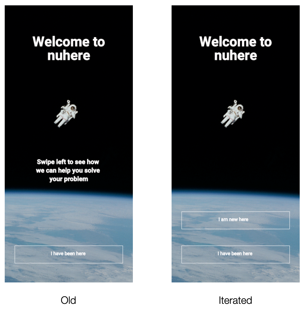
Example 1: necessity to make a choice between onboarding and sign in is visually unclear (high)
Suggested Change:
Start onboarding with a bottom, instead of a gesture. Having two buttons it is clear that a choice has to be made. Wording will be changed to „I’m new here“ and „I’ve been here“ making it easy for users to make a decision.
Evidence:
5 out of 7 participants skipped onboarding. They were scanning the splash screen and went directly for the first button to click.
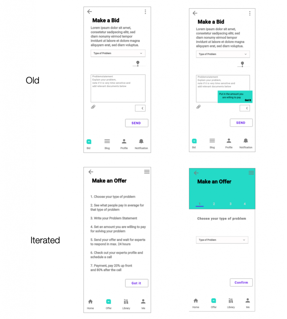
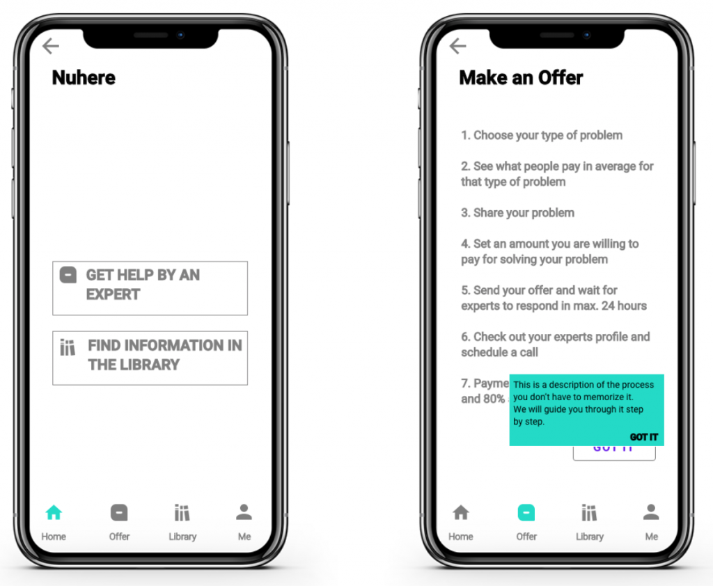
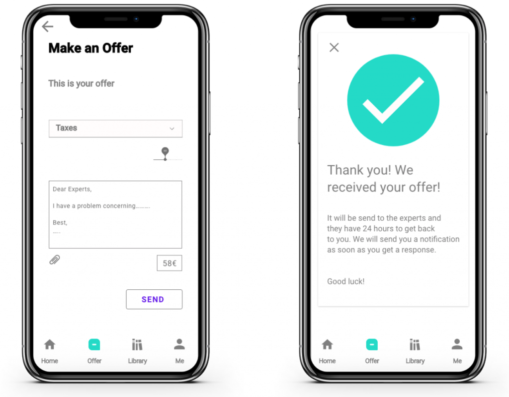
Example 2: making a bid/offer process is too unclear (high)
Suggested Change:
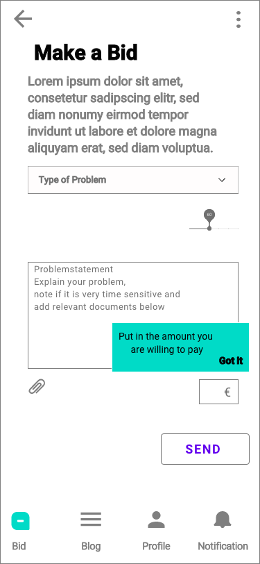
Add an overview showing the steps the users have to do. Use one tab per task to structure the process to easily digestible bites.
Evidence:
All participants guessed after some time gazing at the screen what the bid is about but was very unsure. Since we offer a paid service it is best to give the users confirmation that they are on the right track and the information they need so they want to make an offer.
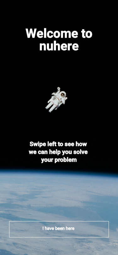
Preference Test
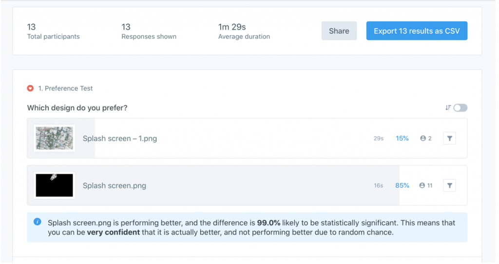
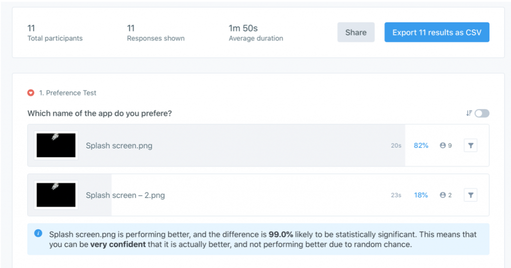
We did two separate tests:
- The image of the splash screen was tested
- The name of the app was tested
For testing UsabilityHub was used and 11-13 people did participate in the test.
A huge majority of users preferred the given name and the currently used image. No iterations needed.
Iterations
Iterations were started early on and were done during the whole 3 month design process.
Iterations were based on:
- Card Sorting
- Usability Testing
- Preference Tests
- Peer Feedback
- Accessibility Criteria
Onboarding
- We want our onboarding screens to be very reduced in the number of elements depicted.
- Although we have just 3-5 elements we struggled to find the right spot for them.
- Usability tests and peer reviews helped to find the right spots for each element.
Sign up
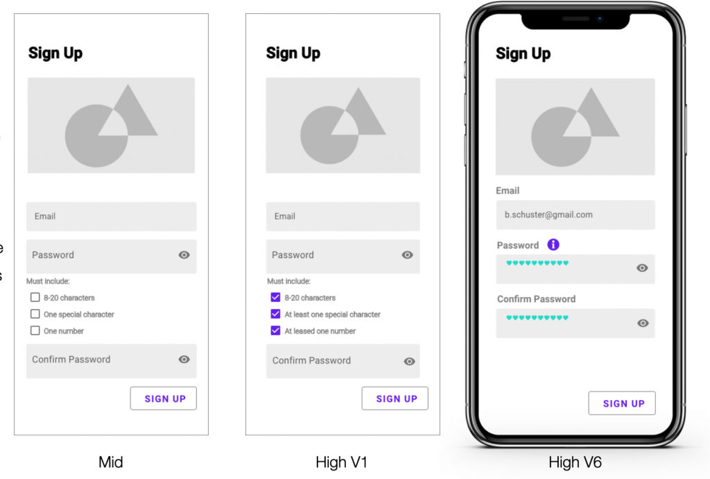
- A check for accessibility was done and issues found concerning the usage of screenreaders when the password requirements being placed behind the password box. Now the information can be found behind an information icon before the users reach the box.
Expert Profile
- The profile was iterated, because it didn’t show enough information.
- The profile is now scrollable (up and down) to fit all the information. Reviews are scrollable too (right to left) to fit as many as needed.
- Buttons lead to experts calendars above the fold and at the end of the page.
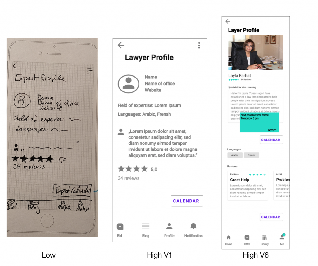
- Coachmarks show the earliest available time.
Calendar
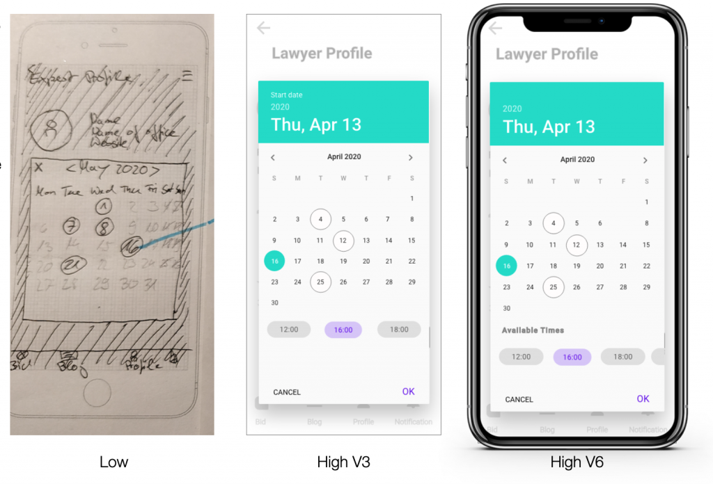
- During peer feedback, it was pointed out, that we are just able to have max. 3 time slots at the screen.
- The screen was iterated and chips are now scrollable, making it possible to show as many time slots as needed.
Messages
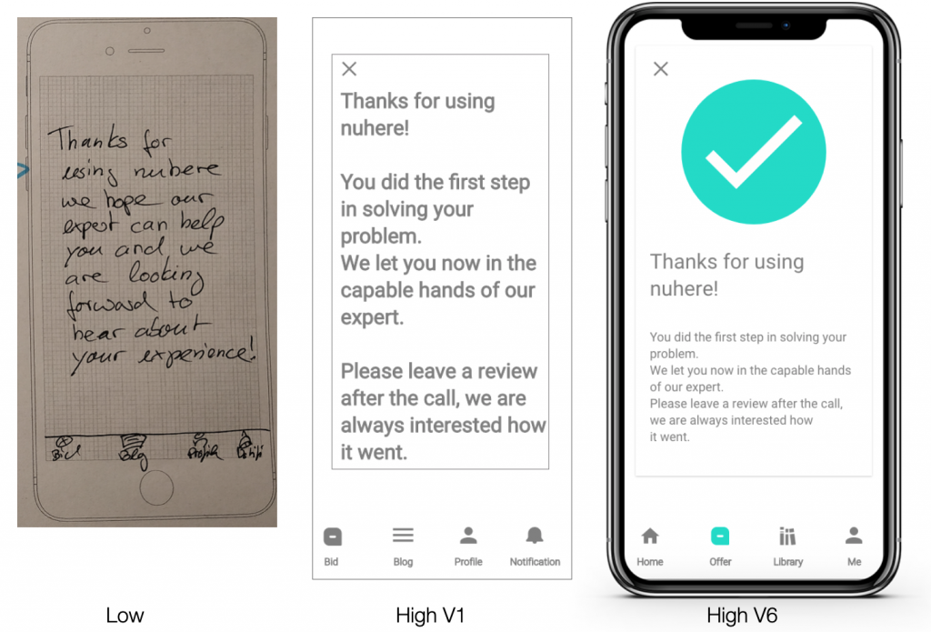
The confirmation messages were iterated to not just give feedback via text, but also via color and icon. This offers users multiple ways of understanding the message and increases accessibility.
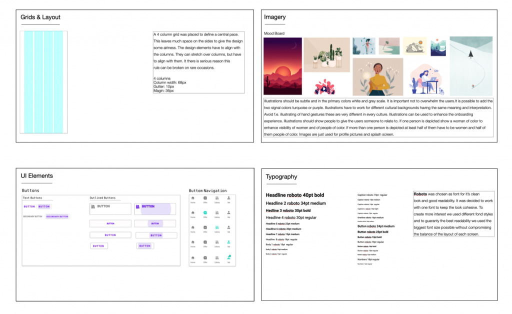
Look & Feel
During iteration I also took more care of the look and feel the prototype.
- Grid layout was added
- Font was chosen
- The color scheme was developed with dos and don’ts of color usage.
- Mood boards and explaining texts were created for illustration and animation so that the assigned person will know what to do and what we are looking for.
- UI element library was created
- The tone of voice defined
All elements were later complied into a style guide.
Final Prototype
Selection of most relevent screens
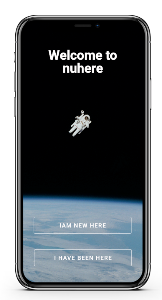
- Splash screen offers two choices get to know the app through onboarding and a sign in
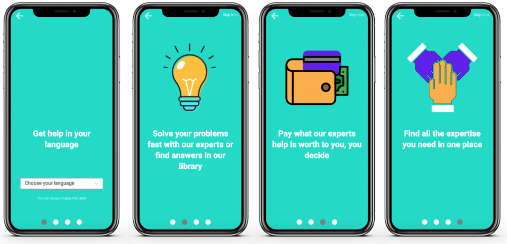
- Benefit oriented onboarding provides key information
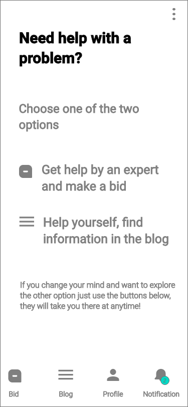
- Simplified home screen lets the users focus on their choice
- Choosing get help by an expert an overview informs the users about the next steps
- A coach mark ensures the users that they are guided through the process
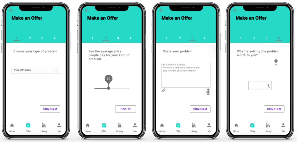
- Users are guided through the 4 step process, each step is one tap which clear instructions and easy to digest tasks
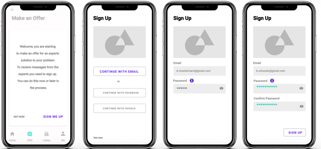
- Sign up is possible at two points. First starting the offer process with a possibility to skip. Second, mandatory before sending the offer
- Before sending their offer the users are given an overview to check
- A confirmation message gives feedback about the successfully send offer and information about the next steps
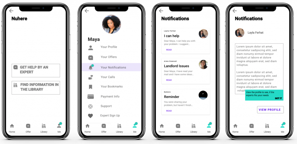
- The users are notified if they have a response by an expert
- Organized as cards the different responses are easy to access
- If an offer process is not finished users get a reminder
- Reading the experts message the users can use a button to go to the expert’s profile
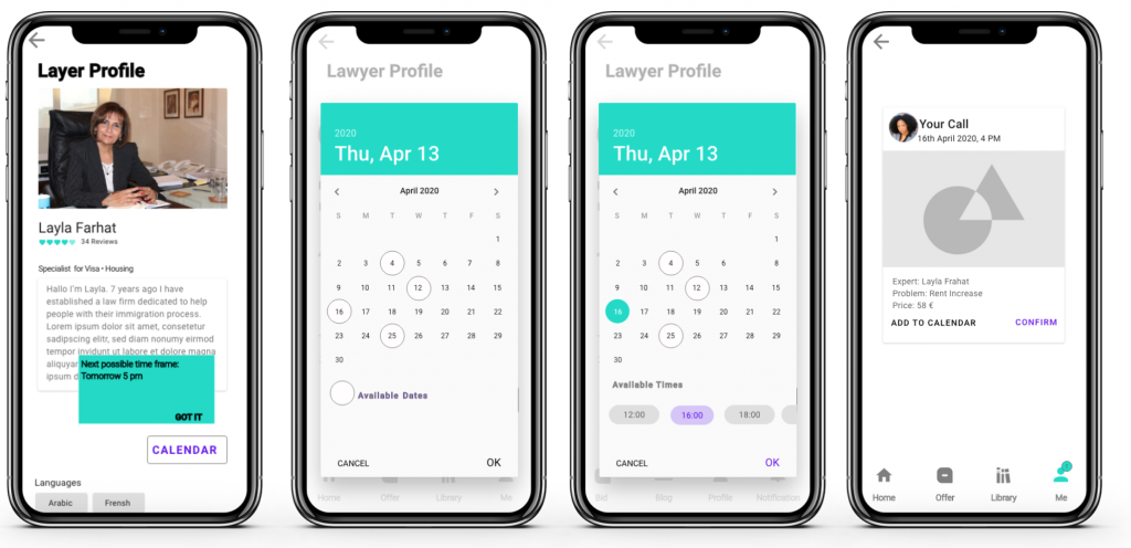
- Profiles are scrollable with reviews below the fold and buttons to the expert’s calendar above the fold and at the bottom of the page
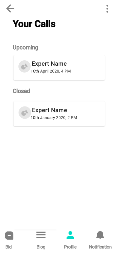
- The calendar shows the experts availability
- A page showing an overview of the call including the price
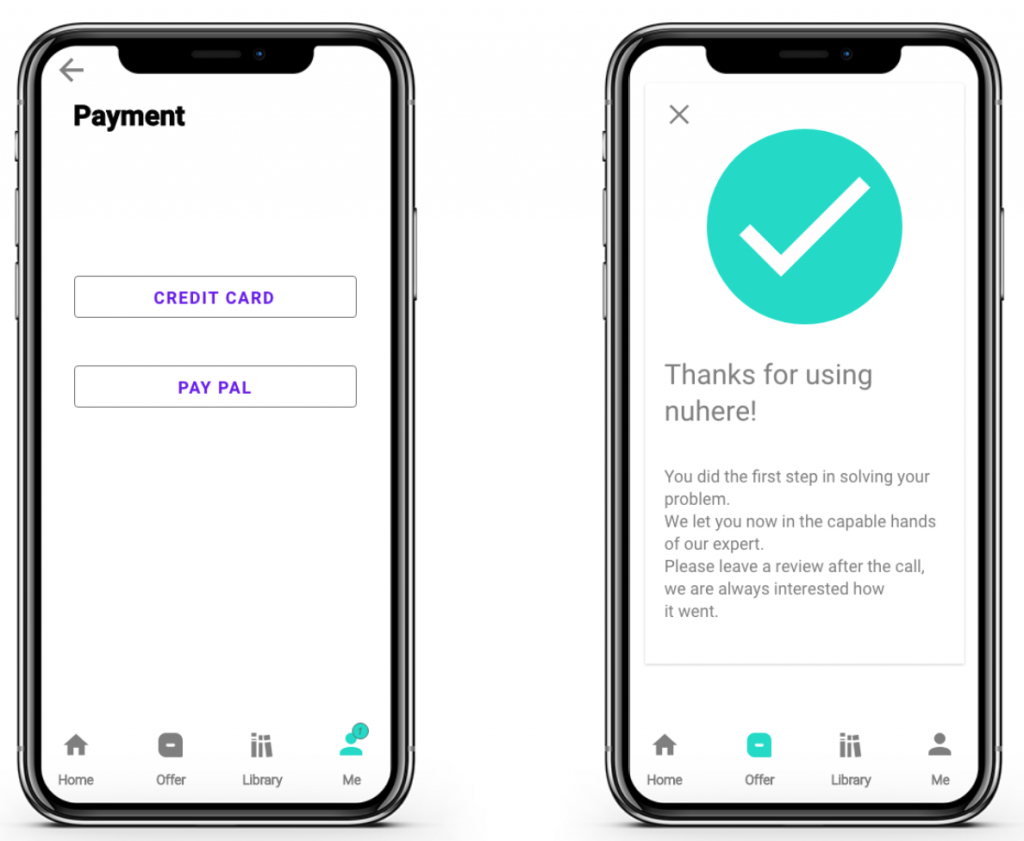
- The payment process is started
- Finishing users get a confirmation message
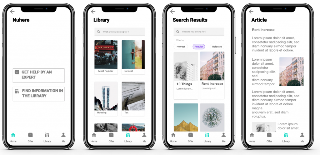
- Users can go to the library to find articles in 6 relevant categories written by experts
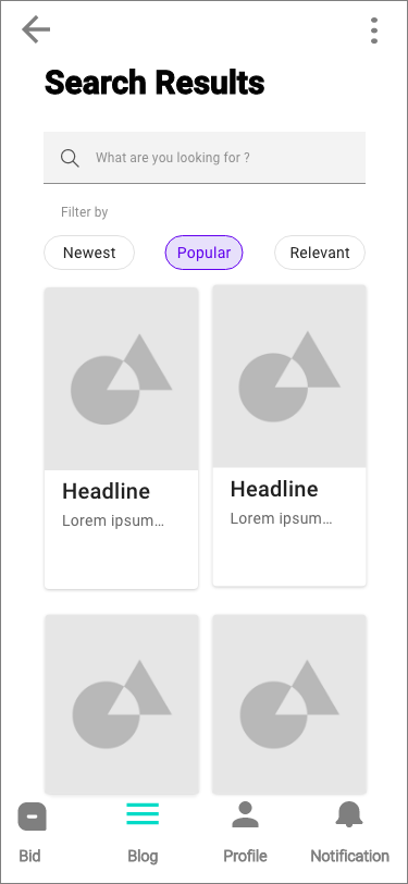
- Articels can be found by choosing a category or by using the search bar
- Search results can be filtered
Images: creative commons, unsplash
Hero Image: Nasa/unsplash
Icon: Iconfinder